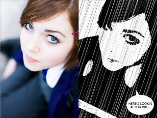
 Following the tutorial supplied on the task brief, I created a Sin City style image from flickr member Orangeacid's image and Photoshop. This exercise proved to be very helpful in understanding the effects of filters and adjustments. While I have had previous experience with these tools, I was not aware I could achieve this look so easily. While I do like the overall outcome, there are elements that could be improved.
To best obtain the comic book ink look, I had to sacrifice almost all detail on the nose and lips, drawing emphasis to the eyes. This is effective for dramatising the mood of the image, however, if I were to comply with the style of Sin City comics, darker lines would be required to illustrate parts of the face, such as the nose. In addition, I would place more emphasis on the gun by moving it to a higher angle, showing the mouth of the weapon. Creating the rain was an interesting task. Although it does serve it's purpose, the number of black lines over her face are excessive and the lines are not random or broken enough to be completely believable. If I had time, I would experiment with different levels and filter effects but that will have to wait til another time.
Exercise 2: Graffiti
Graffiti images supplied from blackboard. Background texture supplied by ground*floor.
The purpose of this task was to create a temporal composition that reveals 3 pieces of graffiti through an animating mask. We were also instructed to use 3D camera views in After Effects.
This task was, by far, the most enjoyable and valuable task to date. Creating stencils from photos of graffiti and applying 3D camera angles to a 2D composition not only created dynamism, but also the interest that my previous animations were lacking. The notion of 'layering' and peering over 'layers' is something I wish to utilise in my final assessment as, in my opinion, is a fundamental process that truly separates 'animation' from moving images. With the use of the hue/saturation and curves tools, I believe I have effectively achieved the cut-out stencil style demonstrated in the video tutorial. This effect will be very useful in my final assessment as I plan to add a similar style to the characters in my animation.

No comments:
Post a Comment