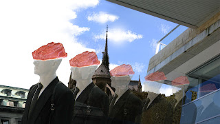
This was my first attempt to create a Spacial Montage with the images we had been given in Photoshop. While I had used Photoshop before, I found this was good way to understand the use of layers. I feel the composition is not as structured as it could have been as I chose my images with little consideration and thought to the concept or message I wanted to portray. As the purpose of this exercise was to experiment with cropping images and space, I focused my attention solely to those aspects. If I were to repeat this exercise with the same images and layout, I would raise the building on the left higher and reduce the negative space in the top left corner. I would also experiment with the colours and possibly add textures or filters to blend the images together.
Exercise 02: Temporal Montage
My first attempt using After Effects. In this piece, there is no flow or meaning intended for the images and thus, this is not a professional or appealing composition. However, as it was merely my attempt to learn how each tool works and how I can manipulate images, creativity was not overly required for this task. I look forward to creating much more meaningful compositions and, in future, will clean up and crop my images prior to animating them.

I think your spacial montage is fantastic. You have very creative ideas. The pictures mesh well together, (particularly the steak and mannequin) resulting in a city-like tone for the montage. This is further complemented by the use of repetition.
ReplyDeleteI know how you feel about the temporal montage. It seems we were both interested in learning the basics. For a first attempt, it's great. I'm looking forward to future projects!